


Monochromatic palettes step aside. A refreshing trend is emerging in the world of bedroom design: pastel hues. Shedding their association solely with children's rooms, pastels are making a sophisticated comeback.
Their charm lies in their versatility. Integration can be subtle, with splashes of color on paintings or bedding, or a more daring expression through accent walls or ceilings.
Whether your style leans towards timeless elegance, contemporary minimalism, or Bohemian charm, there are a few options to incorporate pastels and create a tranquil yet personalized retreat. So let's take a closer look at non-boring ways to embrace these gentle colors.
Pastel Walls with a Twist

While classic walls offer a calming aesthetic, there are methods to bring visual intrigue into your living spot. Here are a few exciting trends that take pastel walls beyond the ordinary:
Accent Walls: Focus Points Creation with Bold Pastel Hues
Instead of painting an entire place, choose a bright pastel wall to highlight that side of the room. This creates a designated focal point that draws the eye and adds depth to the space.
Think millennial pink for a glamorous touch, calming sage green for a carefree escape, or some trendy terracotta to provide a positive and friendly vibe. Feel free to experiment with unexpected choices – a muted mustard yellow will provide a north-facing room with sunshine, while a light blue will bring calm and openness.
Pro Tip: Don't have the energy for a full paint job? Think about removable wallpaper or wall decals. They come in a vast array of pastel tones and patterns, letting you explore various options without commitment. Plus, they are renter-friendly.
Ombre Techniques: Gradual Blending of Pastel Shades for a Dynamic Look
For a truly unique effect, explore the magic of the ombre. This technique involves gradually transitioning between two or more pastel shades, creating a mesmerizing and dynamic effect.
Start by choosing a base color for the majority of the wall. Then, use a lighter shade of the same color or a complementary pastel hue at the top of the wall. With a paint sprayer or a blending tool like a large sponge create a seamless transition between the colors.
This technique works beautifully for high ceilings, drawing the eye upwards and making the room feel taller.
Pro Tip: Get inspired by the outdoors. Pastel hues are reminiscent of a sunrise or sunset with a serene vibe. Imagine a soft peach transitioning to a warm apricot, capturing the essence of a desert sunrise.
Geometric Prints: Showing Details with Pastel Geometric Designs
In case you prefer a more updated approach, think about incorporating geometric patterns into your pastel walls. It can be triangles, hexagons, or chevrons, painted directly onto your walls or using easy-to-remove wallpapers.
Pro Tip: Go beyond paint. Stencils are your friend for creating geometric patterns without the hassle. They come in a bunch of different pre-cut designs, so you can play around with different shapes and sizes. Have fun with color combos. For example, go for a pale yellow with a soft lilac to create an unusual wall statement.
Bold Pastel Furniture Choices

Pastel furniture is no longer relegated to nurseries or vintage tea parties. Today, it is a cool design solution capable of injecting fresh, modern energy into any room. Here are a few hacks on how to incorporate these playful pieces with boldness and creativity:
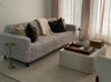
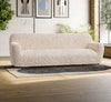
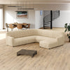
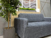
Statement Pieces: Center Stage for Couches, Armchairs, and Tables
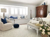
Imagine walking into a room dominated by a plush, blush-pink sofa. The soft hue instantly becomes the captivating centerpiece, that adds a generous dose of color and comfort.
A mint green armchair tucked into a reading nook provides a refreshing feel without overpowering the calm atmosphere.
Even smaller pastel pieces, like a blue coffee table, can attract interest and introduce a playful element.
Great Matching: Choosing the Right Style and Color
Soft shades have gained popularity due to their versatility. They go well with any color and style, easily creating a harmonious look for the space.
Picture a pastel yellow dining chair near a dark wood table. The contrast is balanced – the boldness of the wood is softened by the gentle yellow, while the chair injects a touch of personality.
Feeling more confident? Combine pastels with bright accents to achieve a cheerful, dynamic environment. Imagine a mustard yellow armchair paired with a lavender sofa – a unique combination that reflects a playful spirit.
The possibilities are endless. In the same way, you can implement such tones in vintage or contemporary designs to bring some character to the place.
Upcycling and DIY: Transforming Old Furniture with Pastels
Upcycling old furniture with pastel paints and fabrics is an eco-friendly way to enhance your existing interior design. A coat of soft blue paint can transform a worn-out dresser into a charming piece. Similarly, reupholstering an old chair with pastel fabric can give it a new lease on life.
This approach refreshes your furniture and allows for customization to fit your specific style and preferences.
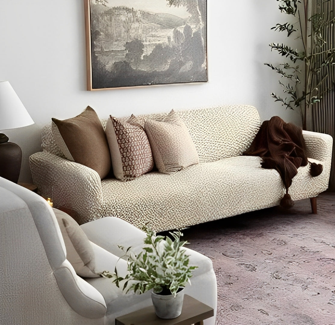
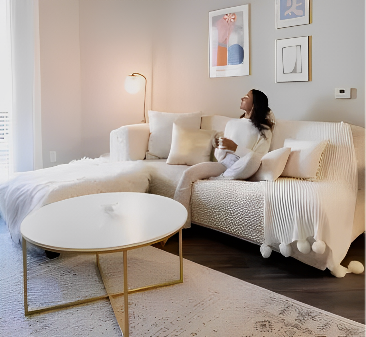
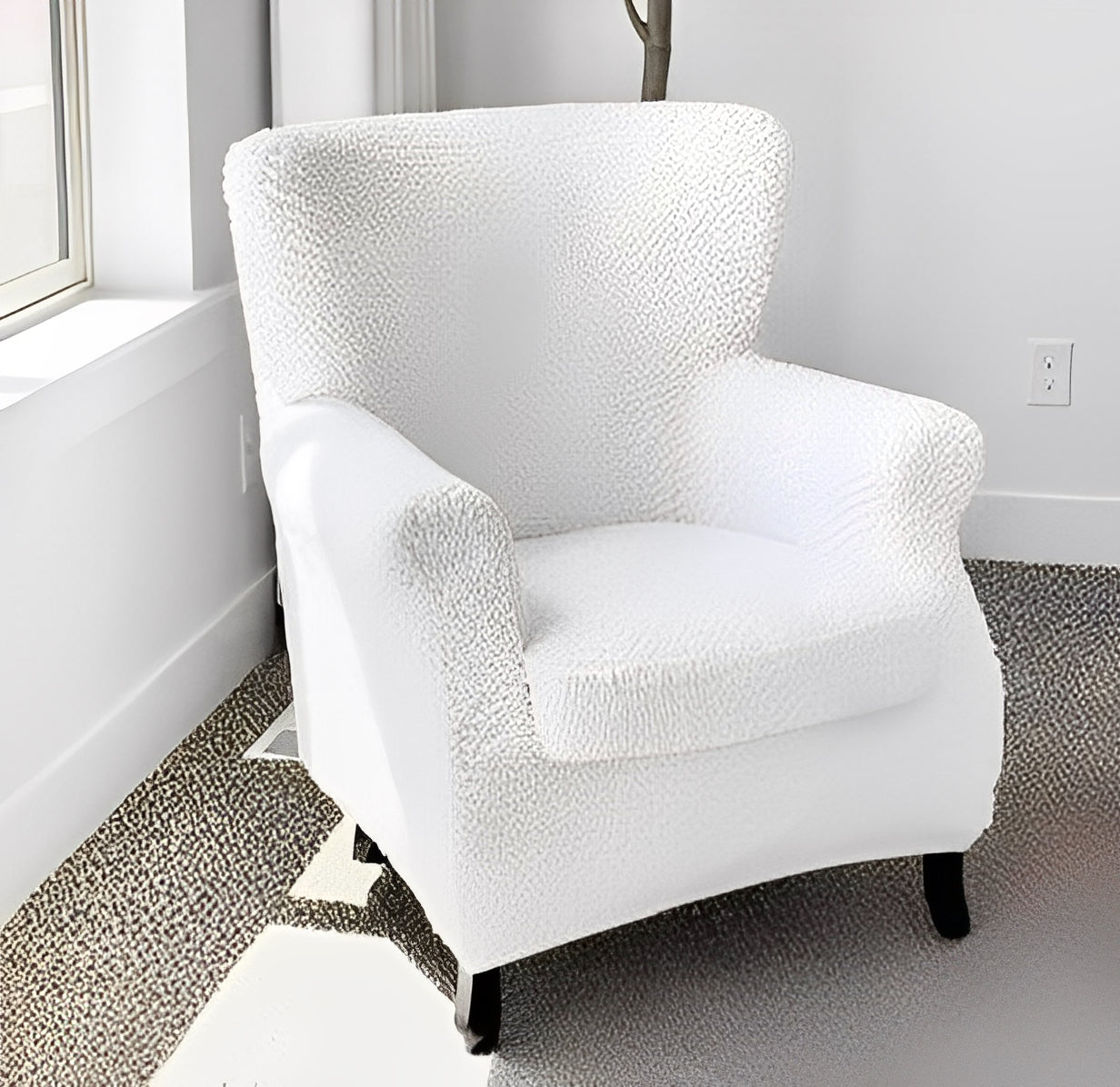
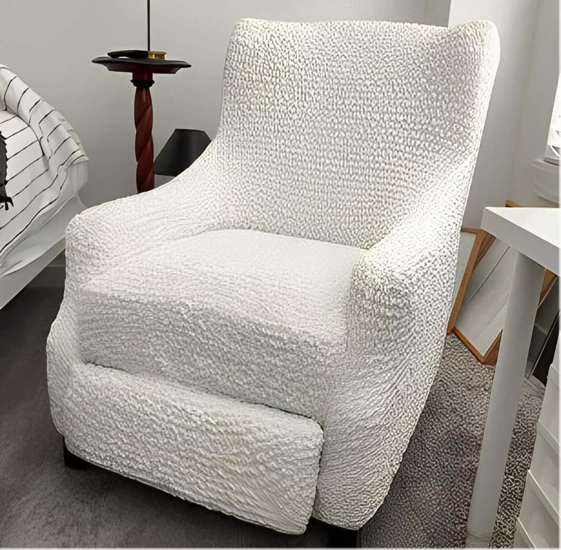
Slipcovers: A Safe Way to Try Out a New Color Combo
Couch covers provide you with a risk-free method to try pastel colors in your interior. You can easily cover your existing furniture with such ones to see how the new color fits into your space.
If you like the look, sectional sofa slipcovers can become a permanent design element. If not, just replace it with another one. With this flexible option, you can easily test different color options without investing much.
Layering with Pastel Textiles

Pastel fabrics are a great way to add a gentle, welcoming feeling to any room in your house. They can make your bedroom feel calm and relaxing, your living room – cozy, or your dining room – fancy. Here are some ideas for using pastel fabrics to decorate your home.
Layer Up for Calm: Pastel Bedding & Drapes for a Serene Space
Start with soft sheets: choose pastel blue or blush pink bedding for a gentle, soothing vibe. Then add a touch of romance by layering a dusty rose throw blanket at the foot of the bed for a charming accent.
Pick your perfect curtains. Opt for lightweight linen curtains in warmer months to keep things airy, or choose heavier velvet curtains for a more luxurious feel.
Don't be afraid to combine different pastel shades or textures. For example, a mint green duvet cover with pale lavender sheets can add depth without being too overwhelming.
Pro Tip: Spice things up with a striped duvet cover and solid-colored sheets, or layer floral patterned curtains with a soft bedspread for a springtime touch.
Pastel Power on the Floor: Cozy Rugs & Warm Textures
Bring warmth, texture, and a touch of color to any room with a pastel rug. A large one can define a cozy sitting area in your living room or add softness underfoot in your bedroom.
For instance, a plush soft pink rug brings some femininity to the room, while a pastel yellow rug can brighten up the place with a cheerful hue. Layering smaller rugs over larger neutral ones can also delineate different areas and make them visually more interesting. Try out rugs with simple floral or geometric pastel patterns to keep the space textural and fun without being too complicated.
Pro Tip: For busy areas, choose a soft-colored rug with a light pattern or a slightly darker shade. It will be easier to keep it clean. In the less busy spots like a guest bedroom, you can explore lighter pastels and more intricate patterns.
Pastel Pops: Throw Pillows & Blankets for Playful Accents
Throw pillows and blankets are a designer's secret weapon for adding effortless color and texture to a space. Their versatility allows for seamless integration of pastel hues into any interior scheme. Furthermore, their ease of replacement makes them ideal for seasonal updates or adapting to evolving design preferences.
A strategic arrangement of throw pillows in pastel shades like mint green, peach, and lavender can enliven a neutral sofa, introducing an air of both playfulness and comfort. Similarly, draping a pastel throw blanket over an armchair or the foot of a bed adds a vibrant touch and another layer of warmth.
Don't hesitate to experiment with a mix of tones and textures. Pairing a plush velvet throw pillow in a delicate blush hue with a chunky knit pastel blue throw creates a visually rich, layered effect that exudes both style and inviting charm.
Pro Tip: Embrace the various shapes and sizes available in throw pillows. A dynamic arrangement can be achieved by thoughtfully mixing and matching different options. Consider incorporating a hand-knitted pastel throw with a pronounced texture to maximize visual interest.
To conclude,
From bold walls with a twist to a symphony of soft textiles, these gentle colors offer endless possibilities to create a calming, personalized haven. Explore a variety of mixing and matching techniques to cultivate a space that embodies your unique aesthetic.
MORE INTERIOR DESIGN IDEAS AND INSIGHTS: